>THN Ranks CCHA Logos
>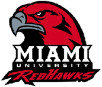 The Hockey News continues their logo rankings today, with the CCHA. For those who are unfamiliar with this, THN does a league-by-league breakdown, everything from the NHL, to the NCAA, to the OHL, and ranks each teams logo by conference. For the CCHA logos, THN says Miami has the third best.
3. Miami RedHawks: formerly the Redmen, Miami of Ohio rebounds with a strikingly intense hawk.
A few things here. It’s great that we’re so high up on the the list…but “Redmen“? Really? Could they not print “Redskins,” or are they just that sadly misinformed?
If you’d like to check out the rest of the THN logo ranking list, it can be found here.
Posted on August 13, 2008, in CCHA. Bookmark the permalink. Leave a comment.

Leave a comment
Comments 0